Right now I’m planning every promotion we’ll be doing in 2013. This represents hundreds of different promotions that will be managed by more than a dozen people. I’ve been using Excel to build my list of promotions so that I could:
- Easily filter them by categories (huge vs mini promotion, sale vs product promotion, etc.)
- Filter them by date or date ranges
- Filter them by who will be running the promotion
- Identify the start or end date and then calculate the other date based on how long the promotion should last

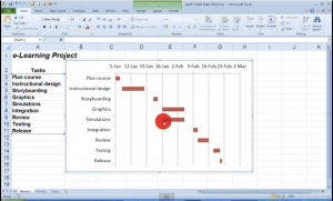
The information is great, but I was having a hard time wrapping my mind around what was going on and how they overlapped. In these situations I find that visuals are incredibly helpful in identifying how much activity will happen in a certain period of time. What I needed was a Gantt chart without the complexity of Microsoft Project. I did a Google search (which is pretty much how I’ve learned to do everything in Excel) and found this YouTube video that taught me to do exactly what I wanted to do (not to mention the instructor is Irish and I LOVE accents!).
I ended up with a chart that was several hundred lines long, which was pretty but wasn’t particularly useful. As I played with different options, I realized that the chart only displays visible cells. So I could filter the data and get really useful visuals. This means I can filter by an individual and see what projects they own over the course of the year and how they overlap AND I can simply look at specific month and see how many promotions would overlap.
I was so excited that I just had to show some of my co-workers. It looks like we’ll be using this simple chart to give us visuals for several other planning-related activities. #soexcited
